
Mastering Your Capsule Wardrobe Color Palette: The Ultimate Guide for Effortless Style in 2026
Affiliate disclosure: This article may contain affiliate links. Recommendations are independent and editorially driven.
In the evolving landscape of women’s fashion, where sustainable style and mindful consumption are increasingly paramount, the concept of a capsule wardrobe has emerged as a revolutionary approach to dressing. But at the heart of every truly successful and versatile capsule lies a critical, often underestimated, element: the meticulously curated capsule wardrobe color palette. This isn’t merely about picking colors you like; it’s about strategically selecting a harmonious collection of hues that ensures every piece in your wardrobe can effortlessly mix and match, creating an infinite array of stylish outfits with fewer garments.
Imagine opening your closet to find that every top complements every bottom, every dress pairs perfectly with your outerwear, and your accessories effortlessly elevate any ensemble. This isn’t a pipe dream for the fashion elite; it’s the tangible reality made possible by a well-thought-out capsule wardrobe color palette. It simplifies decision-making, reduces shopping stress, and empowers you to express your personal style with confidence and ease. In an era where conscious fashion choices are celebrated, understanding and implementing your ideal color palette is the cornerstone of a chic, efficient, and environmentally friendly wardrobe. Join us as we dive deep into the art and science of crafting your perfect color story for 2026 and beyond, transforming your approach to fashion forever.
The Foundation: Understanding Your Personal Color Profile
Before you can even begin to select individual colors for your capsule wardrobe, the most crucial first step is to understand your personal color profile. This isn’t about fleeting trends or what’s “in” this season; it’s about discovering the colors that naturally illuminate your features, make your skin glow, and enhance your overall appearance. Dressing in colors that harmonize with your natural coloring can make you look more vibrant, well-rested, and effortlessly chic. Ignoring this fundamental principle, conversely, can lead to colors washing you out or clashing with your complexion. This foundational knowledge is the bedrock upon which a truly effective capsule wardrobe color palette is built.
Warm, Cool, or Neutral Undertones? Identifying Your Core Temperature
The most basic and important aspect of personal color analysis is determining your skin’s undertone. Unlike your overt skin tone (which can change with sun exposure), your undertone remains constant and is either warm, cool, or neutral. This underlying hue dictates which colors will best complement you.
- Cool Undertones: People with cool undertones typically have pink, red, or blue hues beneath their skin. Their veins often appear blue or purple on the inside of the wrist. They might tan easily or burn quickly. Silver jewelry usually looks more flattering than gold.
- Warm Undertones: Warm undertones manifest as golden, yellow, or peach hues in the skin. Veins on the wrist might appear greener. People with warm undertones tend to tan to a golden-brown. Gold jewelry often enhances their complexion more than silver.
- Neutral Undertones: If you find it hard to distinguish between blue/purple or green veins, or if both gold and silver jewelry look equally good on you, you likely have neutral undertones. This means your skin has a balanced mix of both warm and cool pigments, giving you more flexibility in your color choices.
A simple way to test your undertone at home is the “jewelry test” or the “vein test” in natural light. Observe which metals or vein colors seem to blend seamlessly with your skin, indicating your dominant undertone.
Analyzing Your Hair, Eye, and Skin Tone for a Comprehensive View
While undertones are paramount, a holistic personal color profile also considers your natural hair color, eye color, and overall skin depth. These elements, combined with your undertone, paint a complete picture of your unique coloring.
- Hair Color: Is your hair naturally ash blonde, deep brown, raven black (cool)? Or golden blonde, auburn, rich chestnut (warm)? The natural pigments in your hair contribute significantly to your overall color temperature.
- Eye Color: Blue, grey, emerald green eyes often lean cool, especially if they have icy flecks. Warm eyes might be hazel with golden specks, warm brown, or olive green.
- Skin Tone: Beyond undertone, consider the depth of your skin. Are you fair, light, medium, or deep? This affects the intensity and saturation of colors that will look best on you. Very fair skin might be overwhelmed by very dark or bright colors, while deeper skin tones can beautifully carry rich, saturated hues.
By assessing these three components together, you can refine your understanding of your personal coloring, moving beyond a simple warm/cool binary to a more nuanced appreciation of your unique beauty.
Seasonal Color Analysis: Pinpointing Your Best Palette
Building upon undertones and overall coloring, seasonal color analysis categorizes individuals into one of four main “seasons”: Spring, Summer, Autumn, or Winter. Each season corresponds to a specific set of color characteristics (warm/cool, light/dark, clear/muted) that best flatter that individual. This framework offers a robust starting point for building your capsule wardrobe color palette.
- Spring: Typically warm undertones, light-to-medium skin, often with golden or peachy hues. Hair is usually light blonde, golden brown, or strawberry blonde. Eyes are light and clear (blue, green, hazel). Best colors are light, clear, and warm, like coral, peach, light green, golden yellow, and ivory.
- Summer: Cool undertones, often fair to medium skin that might have a soft pinkish hue. Hair is typically ash blonde or soft brown. Eyes are muted blue, grey-blue, or soft green. Best colors are soft, cool, and muted, like periwinkle, dusty rose, cool grey, lavender, and soft navy.
- Autumn: Warm undertones, often with golden, bronze, or olive skin tones. Hair is rich and warm, like auburn, deep red, or golden brown. Eyes are warm (hazel, brown, warm green). Best colors are rich, warm, and muted, like olive green, rust, mustard yellow, deep teal, and chocolate brown.
- Winter: Cool undertones, often with high contrast between skin and hair (e.g., pale skin and dark hair), or deep, rich skin tones. Hair is dark (black, deep brown) or stark blonde/grey. Eyes are striking (icy blue, deep brown, vivid green). Best colors are clear, cool, and often intense, like true red, royal blue, emerald green, fuchsia, and pure white.
While identifying your season can be incredibly helpful, remember it’s a guide, not a rigid rule. The goal is to understand the *characteristics* of colors that suit you best, rather than feeling confined to a prescribed list. This comprehensive understanding of your personal color profile is the first and most critical step in curating a capsule wardrobe color palette that truly works for you.
Deconstructing the Ideal Capsule Wardrobe Color Palette
Once you understand your personal color profile, the next step is to deconstruct what actually makes up an “ideal” capsule wardrobe color palette. It’s not just a random assortment of flattering shades; it’s a carefully structured system designed for maximum versatility and ease. Think of it as building a house – you need a strong foundation, sturdy walls, and then decorative elements to make it a home. In fashion terms, this translates to core neutrals, versatile accent colors, and strategic pop colors.
[INLINE IMAGE 1: place after second H2 | alt=”capsule wardrobe color palette concept illustration”]
Core Neutrals: The Backbone of Versatility
Neutrals are the undisputed workhorses of any capsule wardrobe, and they form the bulk of your color palette. Their power lies in their ability to pair effortlessly with almost any other color, acting as a canvas upon which you can build countless outfits. Selecting the right neutrals, however, is key to ensuring they harmonize with your personal coloring and with each other.
- Classic Neutrals: Black, white, grey, and various shades of brown and navy are the most common neutrals.
- Personalizing Neutrals: Your personal color profile influences which neutrals look best on you.
- Cool-toned individuals often shine in true black, stark white, cool greys (charcoal, silver grey), and true navy.
- Warm-toned individuals are often better served by off-white, cream, ivory, warm greys (taupe, mushroom), camel, olive green, and richer browns.
- Neutral-toned individuals have the most flexibility and can often wear a broader range of both warm and cool neutrals effectively.
- Quantity: A typical capsule wardrobe might consist of 3-5 core neutrals. For instance, a cool-toned palette might feature black, white, navy, and charcoal grey. A warm-toned palette might include cream, camel, olive, and chocolate brown.
These core neutrals will comprise the majority of your larger items: coats, trousers, skirts, foundational tops, and often key footwear. Their timeless appeal and adaptability make them the most valuable players in your color strategy.
Accent Colors: Adding Personality and Flair
While neutrals provide the base, accent colors are where your personality truly shines through. These are the colors that you wear frequently and that bring joy and life to your outfits. They should be chosen because they flatter your personal coloring and complement your chosen core neutrals.
- Quantity: Typically, 2-4 accent colors are ideal for a flexible capsule.
- Harmony with Neutrals: Your accent colors should seamlessly integrate with your core neutrals. For example, if your core neutrals are black, white, and navy (cool), then accent colors like emerald green, royal blue, fuchsia, or clear red would work beautifully. If your neutrals are cream, camel, and olive (warm), then rust, deep teal, mustard, or coral would be excellent choices.
- Versatility: Aim for accent colors that can be easily mixed and matched with each other and with your neutrals. Think about how many different top-and-bottom combinations you can create with these selected shades.
Accent colors are perfect for blouses, knitwear, dresses, and perhaps a statement blazer. They add depth and variety without overwhelming your palette.
Strategic Pop Colors: Elevating Your Look with Intentional Splashes
Pop colors are the wild cards, the unexpected elements that infuse your capsule with excitement and allow for trend integration without overhauling your entire wardrobe. These are often used sparingly and can be brighter or bolder than your accent colors. Their primary role is to elevate an outfit, provide a focal point, or reflect current trends without committing to a full garment.
- Usage: Pop colors are typically found in accessories like scarves, handbags, shoes, jewelry, or perhaps a single, small item of clothing like a camisole or a vibrant lipstick.
- Complementary to Accents: While they can be bolder, good pop colors still ideally have some relationship to your main palette, perhaps being a brighter version of an accent color or a complementary shade. For example, a warm palette might use a vibrant tangerine or a shocking pink as a pop, while a cool palette might feature electric blue or bright yellow.
- Flexibility: Because pop colors are usually in smaller, less expensive items, they offer a low-commitment way to experiment with new trends or inject seasonal excitement. You can easily swap them out each season or year without disrupting your core capsule.
By thoughtfully structuring your capsule around these three color categories – core neutrals for foundation, accent colors for daily wear and personality, and strategic pop colors for flair – you create a harmonious and incredibly versatile capsule wardrobe color palette. This layered approach ensures that every piece earns its place, contributing to a cohesive and stylish wardrobe that truly works for you.
Building Your Core Palette: The Art of Color Harmony
Once you’ve identified your personal color profile and understood the components of a capsule, the real magic begins: building your core color palette. This involves applying principles of color harmony to ensure that your chosen hues not only flatter you but also work seamlessly together, maximizing the outfit possibilities within your capsule. Far from being restrictive, a well-chosen palette opens up a world of creative mixing and matching.
Monochromatic Magic: Elegant Simplicity
A monochromatic palette utilizes different shades, tints, and tones of a single base color. This approach creates an inherently sophisticated, elongating, and cohesive look. It’s an excellent choice for a capsule wardrobe because it simplifies dressing immensely, as all pieces within that color family are guaranteed to match.
- How it Works: Choose one dominant color (e.g., blue) and then select items in light blue, medium blue, dark blue, dusty blue, etc.
- Benefits: Creates a sense of elegance, makes dressing effortless, and can be very flattering as it emphasizes a single, harmonious hue. It also creates a cohesive minimalist aesthetic.
- Adding Interest: To prevent a monochromatic outfit from looking flat, incorporate different textures (e.g., silk blouse with wool trousers), varying fabric weights, and subtle patterns within the same color family.
Think of an all-cream capsule for a sophisticated warm-toned look, or an all-navy capsule for a sleek, cool-toned vibe. Monochromatic dressing is a testament to the power of simplicity and thoughtful color layering.
Analogous Harmony: Subtle Transitions
Analogous colors are groups of three colors that are next to each other on the color wheel, such as blue, blue-green, and green. This scheme offers more variety than monochromatic but maintains a high degree of harmony because the colors share a common underlying hue.
- How it Works: Select a main color, and then two colors adjacent to it. For example, a warm palette might use yellow, orange-yellow, and orange. A cool palette might feature blue, blue-violet, and violet.
- Benefits: Creates a pleasing, natural flow and a visually cohesive look without being overly matchy. It offers gentle contrast and subtle depth.
- Capsule Application: You could build a core of neutrals, then select accent colors that are analogous. For instance, a neutral base of cream and camel, with analogous accents of olive green, forest green, and a deeper teal.
Analogous palettes are perfect for those who want a bit more color variation than monochromatic but still desire an effortless, coordinated feel.
Complementary Contrasts: Bold and Dynamic
Complementary colors are opposite each other on the color wheel, such as red and green, blue and orange, or yellow and purple. This pairing creates the strongest visual contrast and can be very impactful and dynamic.
- How it Works: Choose two colors directly across from each other.
- Benefits: Generates vibrancy, energy, and a bold statement. It ensures that both colors pop.
- Capsule Application: While a full outfit of complementary colors can be intense, they work wonderfully as a main accent color paired with a neutral, or one color used as a pop against a broader palette. For example, a navy-based capsule (blue) could introduce a vibrant orange handbag or scarf for a striking complementary contrast. Or a deep olive (green) skirt could be paired with a ruby red top.
Using complementary colors strategically adds punch and excitement to your capsule, proving that a cohesive palette doesn’t have to be bland. It’s all about balance and intentional use.
Triadic Palettes: Balanced Vibrancy
A triadic color scheme uses three colors that are evenly spaced around the color wheel, forming a perfect triangle. Examples include red, yellow, and blue; or orange, green, and violet. This scheme offers a balance of vibrancy and harmony.
- How it Works: Pick three colors equidistant on the color wheel.
- Benefits: Provides a rich, balanced, and dynamic palette. It’s often considered the most exciting yet balanced of the classic harmonies.
- Capsule Application: For a capsule, you might choose one dominant color, a secondary color, and use the third as an accent or pop. For instance, a core of neutrals, then a dominant blue, a secondary yellow (perhaps mustard), and a touch of red (maybe a burgundy or a vibrant red accessory).
Triadic palettes require a bit more finesse to execute successfully in a capsule, but when done well, they result in a remarkably vibrant and versatile wardrobe. The key is often to let one color dominate and use the others in smaller proportions or as accents to maintain balance.
Seasonal Capsule Wardrobe Color Palettes for 2026
While your personal color profile provides a timeless foundation, a truly dynamic capsule wardrobe color palette can also incorporate subtle seasonal shifts. This doesn’t mean overhauling your entire closet every few months, but rather strategically introducing or emphasizing certain colors that align with the mood and trends of the current season. For 2026, we’re seeing a beautiful blend of nature-inspired tones, optimistic brights, and grounding classics. By understanding these seasonal nuances, you can keep your capsule feeling fresh and relevant without sacrificing its core versatility.
[INLINE IMAGE 2: place after fourth H2 | alt=”capsule wardrobe color palette comparison illustration”]
Spring’s Fresh Beginnings: Light and Airy
Spring 2026 heralds a return to refreshing, optimistic hues, reminiscent of blooming flowers and clear skies. The palette leans towards lighter, softer, yet vibrant shades that evoke renewal and growth. For your capsule, this means incorporating colors that feel uplifting and bright, moving away from the deeper tones of winter.
- Core Neutrals: Shift towards lighter neutrals like crisp white, ivory, light grey, and perhaps a soft beige or oat.
- Accent Colors: Think pastel yet punchy. Delicate lavenders, mint greens, soft sky blues, butter yellows, and gentle corals are perfect. These colors can be integrated through blouses, light cardigans, or flowy skirts.
- Pop Colors: A vibrant fuchsia, a clear robin’s egg blue, or a zesty lime green can provide a playful kick in accessories.
Fabrics like linen, cotton, and lightweight silks in these colors will capture the essence of spring beautifully. The goal is a light, breathable, and cheerful aesthetic that welcomes the warmer weather.
Summer’s Radiant Hues: Bright and Bold
As temperatures rise, so does the intensity of our desired colors. Summer 2026 embraces a more saturated and confident palette, reflecting long sunny days and vibrant escapism. This is the season to be bolder with your color choices, allowing strong hues to take center stage.
- Core Neutrals: Continue with crisp white, opt for sand beige, or embrace a classic true navy. White denim or linen trousers become essential.
- Accent Colors: Dive into rich turquoise, electric blue, sunny marigold yellow, vibrant tangerine, and luscious emerald green. These colors are fantastic for summer dresses, statement tops, and chic swimwear.
- Pop Colors: Consider unexpected pairings like a hot pink against a bright orange, or a vivid cobalt blue. These can appear in sandals, oversized tote bags, or bold statement jewelry.
The summer palette is about joy, energy, and capturing the spirit of holidays and outdoor living. Embrace fabrics that offer comfort and breathability, allowing these vibrant colors to truly shine.
Autumn’s Rich Tones: Earthy and Cozy
As the leaves turn, so too does the fashion color narrative, moving towards deeper, richer, and more grounded hues for Autumn 2026. This season is all about warmth, comfort, and sophisticated depth, drawing inspiration from nature’s changing canvas.
- Core Neutrals: Transition to warm browns (chocolate, chestnut, espresso), deep olive greens, camel, and darker shades of grey. Black also makes a strong return as a sophisticated option.
- Accent Colors: Embrace the beauty of nature with colors like rust, burnt orange, mustard yellow, deep teal, forest green, burgundy, and plum. These are ideal for knitwear, tailored trousers, and cozy outerwear.
- Pop Colors: A vibrant sapphire blue, a deep ruby red, or a metallic gold can add an opulent touch, especially for evening wear or special accessories like scarves or statement boots.
Autumn’s palette pairs wonderfully with luxurious textures like wool, cashmere, corduroy, and leather. The overall feeling is one of sophisticated comfort and inviting warmth, perfect for layering.
Winter’s Deep Shades: Sophisticated and Striking
Winter 2026 brings with it a desire for polished elegance and striking contrasts. The palette deepens, focusing on rich, often jewel-toned colors and sophisticated dark neutrals that exude luxury and confidence. This is where your capsule leans into timeless pieces that make a powerful statement.
- Core Neutrals: Dominant use of true black, charcoal grey, deep navy, and perhaps a stark white or icy grey for contrast.
- Accent Colors: Jewel tones are paramount: emerald green, ruby red, sapphire blue, amethyst purple. Also, deep cranberry, bottle green, and rich burgundy. These colors are perfect for structured coats, elegant dresses, and luxurious knitwear.
- Pop Colors: A vibrant cobalt blue, a shimmering silver, or a sharp lime green can provide a modern, unexpected edge, particularly in accessories or statement footwear.
Winter fabrics include heavy wools, cashmere, velvet, and silks, all of which enhance the richness of these deep shades. The aim is a refined, powerful, and impeccably styled aesthetic that stands up to the season’s chill.
By intelligently integrating these seasonal inspirations into your core personal color palette, you ensure your capsule wardrobe remains dynamic, on-trend for 2026, and exciting without requiring constant, unsustainable overhauls. It’s about subtle evolution, not revolution, enabling your fashion choices to always feel current and authentic.
Comparison of Seasonal Capsule Wardrobe Color Palette Characteristics
To further illustrate the distinctions and versatility of integrating seasonal influences into your core capsule wardrobe color palette, here’s a comparison table highlighting key characteristics for each season in 2026:
| Season (2026 Focus) | Dominant Mood/Vibe | Key Core Neutrals | Suggested Accent Colors | Strategic Pop Colors | Ideal Fabrics/Textures |
|---|---|---|---|---|---|
| Spring | Fresh, Optimistic, Renewed | White, Ivory, Light Grey, Soft Beige | Lavender, Mint Green, Sky Blue, Butter Yellow, Coral | Fuchsia, Robin’s Egg Blue, Zesty Lime | Linen, Cotton, Lightweight Silk, Chiffon |
| Summer | Vibrant, Energetic, Bold | Crisp White, Sand Beige, True Navy | Turquoise, Electric Blue, Marigold, Tangerine, Emerald Green | Hot Pink, Cobalt Blue, Lemon Yellow | Cotton, Linen Blends, Rayon, Seersucker |
| Autumn | Warm, Cozy, Sophisticated | Chocolate Brown, Olive Green, Camel, Dark Grey, Black | Rust, Burnt Orange, Mustard Yellow, Deep Teal, Burgundy, Plum | Sapphire Blue, Ruby Red, Metallic Gold | Wool, Cashmere, Corduroy, Leather, Tweed |
| Winter | Elegant, Striking, Luxurious | True Black, Charcoal Grey, Deep Navy, Icy White | Emerald Green, Ruby Red, Sapphire Blue, Amethyst Purple | Vibrant Cobalt, Shimmering Silver, Chartreuse Green | Heavy Wool, Velvet, Cashmere, Brocade, Silk Satin |
From Concept to Closet: Practical Application of Your Palette
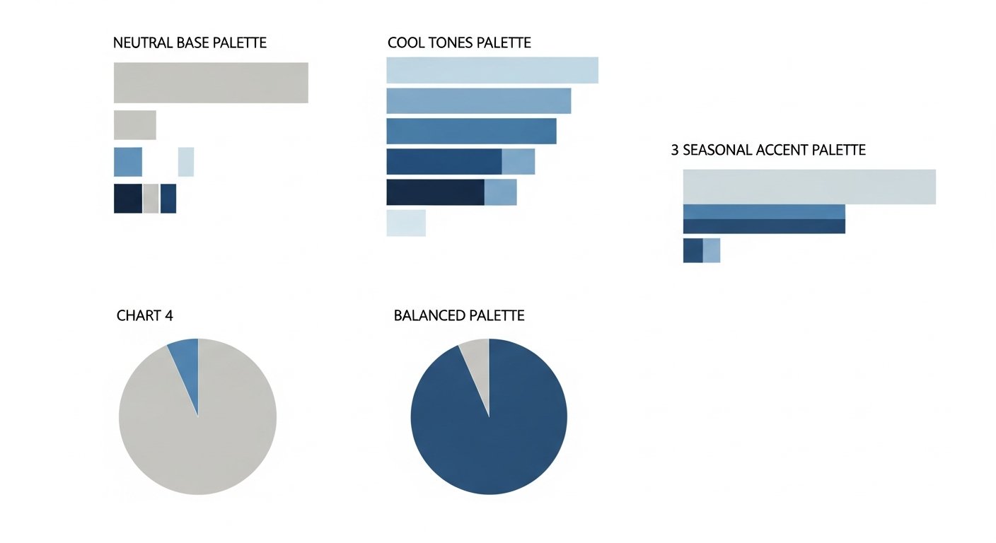
Having a well-defined capsule wardrobe color palette on paper is one thing; bringing it to life in your actual closet is another. This is where the practical application comes into play. The goal is to move from theoretical knowledge to actionable steps that transform your current wardrobe into a cohesive, versatile, and stylish collection that truly reflects your personal color story and makes getting dressed a joy, not a chore.
Auditing Your Current Wardrobe with a Color Lens
The first and most crucial step in applying your new color palette is to conduct a thorough audit of your existing wardrobe. This isn’t just about decluttering; it’s about evaluating each item through the specific lens of your identified personal and seasonal color palette.
- Empty Your Closet: Take everything out. Yes, everything. This gives you a fresh perspective and forces you to confront every single item.
- Categorize by Color: Group similar colored items together. You’ll quickly see patterns and identify dominant hues.
- Evaluate Against Your Palette: For each item, ask yourself:
- Does this color flatter my personal coloring (warm/cool/neutral undertones)?
- Does it fit into my chosen core neutrals, accent colors, or strategic pop colors?
- Does it harmonize with at least 2-3 other items in my *ideal* palette?
- Make Decisions: Create three piles:
- Keep: Items that perfectly align with your palette and you love.
- Consider/Alter: Items that might be the right color but need tailoring, or items that are a “near miss” in color but you adore the style (can they be dyed, if suitable?).
- Donate/Sell/Discard: Items that simply do not work with your palette, are unflattering, or are worn out. Be ruthless – these items are hindering your capsule’s potential.
This audit will reveal gaps, redundancies, and items that are actively working against your goal of a cohesive capsule. It’s an empowering process that sets the stage for smarter shopping.
Shopping Smart: Intentional Color Choices
With your audit complete and your ideal color palette firmly in mind, your shopping habits will fundamentally change. The days of impulse buys based on fleeting trends or emotional appeals are over. Now, every purchase is an intentional, strategic investment.
- Shop with a List: Based on your audit, identify specific items and colors you need to fill gaps in your capsule.
- Stick to Your Palette: Before purchasing, mentally (or physically, if you carry a small swatch) compare the item’s color to your established palette. Does it fit neatly into a neutral, accent, or pop category?
- Prioritize Versatility: Can this new item be paired with at least three other items already in your capsule? The more combinations, the better.
- Invest in Quality Neutrals: Since your core neutrals form the backbone, prioritize quality over quantity for these items. They will be worn most frequently.
- Resist “One-Off” Colors: Avoid buying items in colors that have no other counterparts in your wardrobe, unless it’s a very deliberate pop accessory.
Shopping smart means curating, not accumulating. It’s about making every new addition enhance the power and flexibility of your existing capsule wardrobe color palette.
Mixing and Matching: Endless Outfit Possibilities
The true power of a well-curated capsule wardrobe color palette lies in its ability to generate countless outfits from a limited number of items. This is where the “effortless style” promise comes to fruition.
- Neutral Base, Color Accent: Start with a neutral bottom (trousers, skirt) and a neutral top, then add an accent color blazer or scarf. Or, start with a neutral bottom and an accent-colored top.
- Monochromatic Layering: Combine different shades of a single color. A deep navy trouser with a lighter navy knit and a medium blue scarf creates a sophisticated, multi-dimensional look.
- Analogous Combinations: Pair items whose colors are next to each other on the color wheel for a soft, harmonious blend (e.g., olive green with a deep teal).
- Strategic Complementary Pops: Use a neutral base, add an accent color, and then introduce a small item in its complementary color for a vibrant pop (e.g., grey trousers, emerald green top, with a small red bag).
- Texture and Silhouette: Don’t forget that mixing textures (e.g., silky blouse with a chunky knit) and varying silhouettes (e.g., fitted top with wide-leg trousers) adds visual interest even within a limited color palette.
Experimentation is key. Spend time in front of your mirror trying different combinations. You’ll be amazed at how many fresh looks you can create when every item intrinsically works with another.
Accessories: The Secret Weapon for Color Integration
Accessories are not just afterthoughts; they are powerful tools for integrating color, adding personality, and refreshing outfits without needing to buy new garments. They are particularly effective for introducing pop colors or subtly shifting your palette season by season.
- Scarves: A patterned scarf with multiple colors from your palette can tie an entire outfit together or introduce a new pop.
- Jewelry: Statement necklaces, earrings, or bracelets in specific accent or pop colors can draw the eye and complement your outfit.
- Handbags: A handbag in an accent or pop color can dramatically change the feel of a neutral outfit. For instance, a classic black and white outfit gets a fresh twist with a bright yellow bag.
- Shoes: Footwear in an accent or pop color can be a surprisingly effective way to add a stylish touch. Think red ballet flats or emerald green heels.
- Belts: A belt in an accent color can break up a monochromatic look or define a waist.
Accessories allow for playful experimentation. They are an economical and sustainable way to expand the perceived variety of your capsule wardrobe, making your carefully chosen capsule wardrobe color palette feel continuously fresh and exciting.
Sustainable Style through Strategic Color Planning
In the global conversation about fashion in 2026, sustainability is no longer a niche concern but a central tenet. The concept of a capsule wardrobe, by its very nature, champions a more sustainable approach to style. However, the intentional development of a capsule wardrobe color palette takes this commitment to sustainability even further, offering profound benefits for both your personal style and the planet. It’s a powerful tool in combating fast fashion’s environmental toll.
Reducing Waste and Overconsumption
One of the most immediate and impactful benefits of a strategic color palette is its role in curbing overconsumption. When every item in your closet is chosen for its harmonious color and versatility, you naturally buy fewer clothes. This reduction in purchasing translates directly to:
- Less Textile Waste: Fewer items bought means fewer items eventually discarded. The fashion industry is a major contributor to landfill waste, with millions of tons of textiles ending up in dumps each year. A smaller, more curated wardrobe directly addresses this.
- Reduced “Never Worn” Items: The phenomenon of buying clothes that sit in the closet with tags still on is rampant. A strict color palette ensures that almost every purchase is a thoughtful one, reducing those regrettable, unworn items that contribute to waste.
- Longer Garment Lifespans: Because items are more versatile and easily combinable, they get more wear. This extends the active life of each garment, reducing the frequency with which you need to replace them.
By making every piece count, a well-planned color palette inherently leads to a more minimalist and eco-conscious consumption pattern.
Investing in Longevity: Timeless Color Choices
A smart capsule wardrobe color palette prioritizes timelessness over fleeting trends. While seasonal accents and pops can be introduced, the core of your palette (neutrals and primary accent colors) should consist of hues that transcend individual seasons and years. This approach is intrinsically sustainable because it promotes longevity.
- Beyond Trends: Classic colors like navy, camel, charcoal, cream, and timeless jewel tones rarely go out of style. Investing in high-quality garments in these colors ensures they remain relevant and wearable for many years.
- Building a Core: By focusing your primary investments (e.g., outerwear, foundational trousers, quality knitwear) on these timeless colors, you create a durable core that can be easily updated with less expensive, trend-driven accessories.
- Reduced Fashion Cycles: When your wardrobe is built on a foundation of timeless colors, you’re less susceptible to the constant pressure of fast fashion cycles, where items are designed to be discarded after a single season.
This long-term perspective on color selection encourages a wardrobe of enduring appeal, moving away from disposable fashion towards cherished, long-lasting pieces.
The Environmental Impact of Dyeing Processes
Beyond reducing overall consumption, conscious color choices can also indirectly mitigate the environmental impact of textile production itself. The dyeing process in fashion is notoriously resource-intensive and polluting:
- Water Pollution: Textile dyeing is one of the largest polluters of clean water globally, with wastewater often containing toxic chemicals that are discharged into rivers and ecosystems.
- Water Consumption: Producing and dyeing fabrics requires vast amounts of water.
- Chemical Usage: A myriad of chemicals are used in the dyeing process, many of which are harmful to workers and the environment if not managed responsibly.
While choosing your personal palette doesn’t directly change industry practices, a commitment to a smaller, more intentional wardrobe means you are supporting the production of fewer dyed garments overall. Furthermore, by investing in quality items from brands that prioritize sustainable manufacturing practices and responsible dyeing (e.g., using natural dyes, closed-loop systems, or less water-intensive methods), your informed color decisions contribute to a larger shift towards ethical production. Understanding your color palette empowers you to be a more discerning consumer, favoring longevity and responsible production over fleeting, environmentally costly trends. It’s a key pillar of true sustainable style.
Advanced Color Palette Strategies for the Fashion-Forward
Once you’ve mastered the basics of creating a harmonious capsule wardrobe color palette, you might be ready to explore more advanced strategies. These techniques allow you to inject greater creativity, express a nuanced sense of style, and adapt your palette for an even wider range of occasions, all while maintaining the core versatility and efficiency of your capsule.
The Role of Prints and Patterns
Prints and patterns might seem counter-intuitive to a minimalist capsule, but when chosen strategically, they can add immense visual interest and personality without disrupting your color harmony. The key is thoughtful selection.
- Integrating Core Colors: Opt for prints that incorporate at least two to three colors from your existing palette. A floral print, for example, that features your core neutral (e.g., navy background) with a few of your accent colors (e.g., emerald green and soft pink flowers) will seamlessly integrate.
- Neutral Patterns: Stripes, subtle plaids, or polka dots in neutral colors (e.g., black and white stripes, grey plaid) are incredibly versatile and act almost like solid neutrals themselves.
- Statement Prints: For a bold pop, choose a single statement print item (e.g., a patterned scarf or a printed blouse) where the dominant colors still nod to your palette, even if it introduces one or two new, complementary shades.
- Scale and Frequency: Consider the scale of the print (large prints make a bigger statement) and how frequently you’ll wear it. A subtle print on a silk blouse will offer more versatility than a large, loud pattern on a coat.
Prints, when chosen with your palette in mind, become an extension of your color story rather than a distraction, adding texture and dynamism to your outfits.
Experimenting with Unexpected Color Pairings
While classic color harmonies are safe bets, pushing the boundaries with unexpected pairings can result in incredibly fresh and fashion-forward looks. This requires a confident understanding of your palette and a willingness to play.
- Monochromatic with a Jolt: Take a monochromatic base (e.g., all camel) and introduce a single, high-contrast pop color in an unexpected place (e.g., a neon yellow belt or bright blue shoes).
- “Clashing” with Intent: Sometimes, colors that traditionally “clash” can create an edgy, modern aesthetic when done intentionally. For example, pairing a soft pastel (like lilac) with a rich, earthy tone (like olive green) can be surprisingly
Mastering Your Capsule Wardrobe Color Palette: The Ultimate Guide for Effortless Style in 2026
Affiliate disclosure: This article may contain affiliate links. Recommendations are independent and editorially driven.
In the evolving landscape of women’s fashion, where sustainable style and mindful consumption are increasingly paramount, the concept of a capsule wardrobe has emerged as a revolutionary approach to dressing. But at the heart of every truly successful and versatile capsule lies a critical, often underestimated, element: the meticulously curated capsule wardrobe color palette. This isn’t merely about picking colors you like; it’s about strategically selecting a harmonious collection of hues that ensures every piece in your wardrobe can effortlessly mix and match, creating an infinite array of stylish outfits with fewer garments.
Imagine opening your closet to find that every top complements every bottom, every dress pairs perfectly with your outerwear, and your accessories effortlessly elevate any ensemble. This isn’t a pipe dream for the fashion elite; it’s the tangible reality made possible by a well-thought-out capsule wardrobe color palette. It simplifies decision-making, reduces shopping stress, and empowers you to express your personal style with confidence and ease. In an era where conscious fashion choices are celebrated, understanding and implementing your ideal color palette is the cornerstone of a chic, efficient, and environmentally friendly wardrobe. Join us as we dive deep into the art and science of crafting your perfect color story for 2026 and beyond, transforming your approach to fashion forever.
The Foundation: Understanding Your Personal Color Profile
Before you can even begin to select individual colors for your capsule wardrobe, the most crucial first step is to understand your personal color profile. This isn’t about fleeting trends or what’s “in” this season; it’s about discovering the colors that naturally illuminate your features, make your skin glow, and enhance your overall appearance. Dressing in colors that harmonize with your natural coloring can make you look more vibrant, well-rested, and effortlessly chic. Ignoring this fundamental principle, conversely, can lead to colors washing you out or clashing with your complexion. This foundational knowledge is the bedrock upon which a truly effective capsule wardrobe color palette is built.
Warm, Cool, or Neutral Undertones? Identifying Your Core Temperature
The most basic and important aspect of personal color analysis is determining your skin’s undertone. Unlike your overt skin tone (which can change with sun exposure), your undertone remains constant and is either warm, cool, or neutral. This underlying hue dictates which colors will best complement you.
- Cool Undertones: People with cool undertones typically have pink, red, or blue hues beneath their skin. Their veins often appear blue or purple on the inside of the wrist. They might tan easily or burn quickly. Silver jewelry usually looks more flattering than gold.
- Warm Undertones: Warm undertones manifest as golden, yellow, or peach hues in the skin. Veins on the wrist might appear greener. People with warm undertones tend to tan to a golden-brown. Gold jewelry often enhances their complexion more than silver.
- Neutral Undertones: If you find it hard to distinguish between blue/purple or green veins, or if both gold and silver jewelry look equally good on you, you likely have neutral undertones. This means your skin has a balanced mix of both warm and cool pigments, giving you more flexibility in your color choices.
A simple way to test your undertone at home is the “jewelry test” or the “vein test” in natural light. Observe which metals or vein colors seem to blend seamlessly with your skin, indicating your dominant undertone.
Analyzing Your Hair, Eye, and Skin Tone for a Comprehensive View
While undertones are paramount, a holistic personal color profile also considers your natural hair color, eye color, and overall skin depth. These elements, combined with your undertone, paint a complete picture of your unique coloring.
- Hair Color: Is your hair naturally ash blonde, deep brown, raven black (cool)? Or golden blonde, auburn, rich chestnut (warm)? The natural pigments in your hair contribute significantly to your overall color temperature.
- Eye Color: Blue, grey, emerald green eyes often lean cool, especially if they have icy flecks. Warm eyes might be hazel with golden specks, warm brown, or olive green.
- Skin Tone: Beyond undertone, consider the depth of your skin. Are you fair, light, medium, or deep? This affects the intensity and saturation of colors that will look best on you. Very fair skin might be overwhelmed by very dark or bright colors, while deeper skin tones can beautifully carry rich, saturated hues.
By assessing these three components together, you can refine your understanding of your personal coloring, moving beyond a simple warm/cool binary to a more nuanced appreciation of your unique beauty.
Seasonal Color Analysis: Pinpointing Your Best Palette
Building upon undertones and overall coloring, seasonal color analysis categorizes individuals into one of four main “seasons”: Spring, Summer, Autumn, or Winter. Each season corresponds to a specific set of color characteristics (warm/cool, light/dark, clear/muted) that best flatter that individual. This framework offers a robust starting point for building your capsule wardrobe color palette.
- Spring: Typically warm undertones, light-to-medium skin, often with golden or peachy hues. Hair is usually light blonde, golden brown, or strawberry blonde. Eyes are light and clear (blue, green, hazel). Best colors are light, clear, and warm, like coral, peach, light green, golden yellow, and ivory.
- Summer: Cool undertones, often fair to medium skin that might have a soft pinkish hue. Hair is typically ash blonde or soft brown. Eyes are muted blue, grey-blue, or soft green. Best colors are soft, cool, and muted, like periwinkle, dusty rose, cool grey, lavender, and soft navy.
- Autumn: Warm undertones, often with golden, bronze, or olive skin tones. Hair is rich and warm, like auburn, deep red, or golden brown. Eyes are warm (hazel, brown, warm green). Best colors are rich, warm, and muted, like olive green, rust, mustard yellow, deep teal, and chocolate brown.
- Winter: Cool undertones, often with high contrast between skin and hair (e.g., pale skin and dark hair), or deep, rich skin tones. Hair is dark (black, deep brown) or stark blonde/grey. Eyes are striking (icy blue, deep brown, vivid green). Best colors are clear, cool, and often intense, like true red, royal blue, emerald green, fuchsia, and pure white.
While identifying your season can be incredibly helpful, remember it’s a guide, not a rigid rule. The goal is to understand the *characteristics* of colors that suit you best, rather than feeling confined to a prescribed list. This comprehensive understanding of your personal color profile is the first and most critical step in curating a capsule wardrobe color palette that truly works for you.
Deconstructing the Ideal Capsule Wardrobe Color Palette
Once you understand your personal color profile, the next step is to deconstruct what actually makes up an “ideal” capsule wardrobe color palette. It’s not just a random assortment of flattering shades; it’s a carefully structured system designed for maximum versatility and ease. Think of it as building a house – you need a strong foundation, sturdy walls, and then decorative elements to make it a home. In fashion terms, this translates to core neutrals, versatile accent colors, and strategic pop colors.
[INLINE IMAGE 1: place after second H2 | alt=”capsule wardrobe color palette concept illustration”]
Core Neutrals: The Backbone of Versatility
Neutrals are the undisputed workhorses of any capsule wardrobe, and they form the bulk of your color palette. Their power lies in their ability to pair effortlessly with almost any other color, acting as a canvas upon which you can build countless outfits. Selecting the right neutrals, however, is key to ensuring they harmonize with your personal coloring and with each other.
- Classic Neutrals: Black, white, grey, and various shades of brown and navy are the most common neutrals.
- Personalizing Neutrals: Your personal color profile influences which neutrals look best on you.
- Cool-toned individuals often shine in true black, stark white, cool greys (charcoal, silver grey), and true navy.
- Warm-toned individuals are often better served by off-white, cream, ivory, warm greys (taupe, mushroom), camel, olive green, and richer browns.
- Neutral-toned individuals have the most flexibility and can often wear a broader range of both warm and cool neutrals effectively.
- Quantity: A typical capsule wardrobe might consist of 3-5 core neutrals. For instance, a cool-toned palette might feature black, white, navy, and charcoal grey. A warm-toned palette might include cream, camel, olive, and chocolate brown.
These core neutrals will comprise the majority of your larger items: coats, trousers, skirts, foundational tops, and often key footwear. Their timeless appeal and adaptability make them the most valuable players in your color strategy.
Accent Colors: Adding Personality and Flair
While neutrals provide the base, accent colors are where your personality truly shines through. These are the colors that you wear frequently and that bring joy and life to your outfits. They should be chosen because they flatter your personal coloring and complement your chosen core neutrals.
- Quantity: Typically, 2-4 accent colors are ideal for a flexible capsule.
- Harmony with Neutrals: Your accent colors should seamlessly integrate with your core neutrals. For example, if your core neutrals are black, white, and navy (cool), then accent colors like emerald green, royal blue, fuchsia, or clear red would work beautifully. If your neutrals are cream, camel, and olive (warm), then rust, deep teal, mustard, or coral would be excellent choices.
- Versatility: Aim for accent colors that can be easily mixed and matched with each other and with your neutrals. Think about how many different top-and-bottom combinations you can create with these selected shades.
Accent colors are perfect for blouses, knitwear, dresses, and perhaps a statement blazer. They add depth and variety without overwhelming your palette.
Strategic Pop Colors: Elevating Your Look with Intentional Splashes
Pop colors are the wild cards, the unexpected elements that infuse your capsule with excitement and allow for trend integration without overhauling your entire wardrobe. These are often used sparingly and can be brighter or bolder than your accent colors. Their primary role is to elevate an outfit, provide a focal point, or reflect current trends without committing to a full garment.
- Usage: Pop colors are typically found in accessories like scarves, handbags, shoes, jewelry, or perhaps a single, small item of clothing like a camisole or a vibrant lipstick.
- Complementary to Accents: While they can be bolder, good pop colors still ideally have some relationship to your main palette, perhaps being a brighter version of an accent color or a complementary shade. For example, a warm palette might use a vibrant tangerine or a shocking pink as a pop, while a cool palette might feature electric blue or bright yellow.
- Flexibility: Because pop colors are usually in smaller, less expensive items, they offer a low-commitment way to experiment with new trends or inject seasonal excitement. You can easily swap them out each season or year without disrupting your core capsule.
By thoughtfully structuring your capsule around these three color categories – core neutrals for foundation, accent colors for daily wear and personality, and strategic pop colors for flair – you create a harmonious and incredibly versatile capsule wardrobe color palette. This layered approach ensures that every piece earns its place, contributing to a cohesive and stylish wardrobe that truly works for you.
Building Your Core Palette: The Art of Color Harmony
Once you’ve identified your personal color profile and understood the components of a capsule, the real magic begins: building your core color palette. This involves applying principles of color harmony to ensure that your chosen hues not only flatter you but also work seamlessly together, maximizing the outfit possibilities within your capsule. Far from being restrictive, a well-chosen palette opens up a world of creative mixing and matching.
Monochromatic Magic: Elegant Simplicity
A monochromatic palette utilizes different shades, tints, and tones of a single base color. This approach creates an inherently sophisticated, elongating, and cohesive look. It’s an excellent choice for a capsule wardrobe because it simplifies dressing immensely, as all pieces within that color family are guaranteed to match.
- How it Works: Choose one dominant color (e.g., blue) and then select items in light blue, medium blue, dark blue, dusty blue, etc.
- Benefits: Creates a sense of elegance, makes dressing effortless, and can be very flattering as it emphasizes a single, harmonious hue. It also creates a cohesive minimalist aesthetic.
- Adding Interest: To prevent a monochromatic outfit from looking flat, incorporate different textures (e.g., silk blouse with wool trousers), varying fabric weights, and subtle patterns within the same color family.
Think of an all-cream capsule for a sophisticated warm-toned look, or an all-navy capsule for a sleek, cool-toned vibe. Monochromatic dressing is a testament to the power of simplicity and thoughtful color layering.
Analogous Harmony: Subtle Transitions
Analogous colors are groups of three colors that are next to each other on the color wheel, such as blue, blue-green, and green. This scheme offers more variety than monochromatic but maintains a high degree of harmony because the colors share a common underlying hue.
- How it Works: Select a main color, and then two colors adjacent to it. For example, a warm palette might use yellow, orange-yellow, and orange. A cool palette might feature blue, blue-violet, and violet.
- Benefits: Creates a pleasing, natural flow and a visually cohesive look without being overly matchy. It offers gentle contrast and subtle depth.
- Capsule Application: You could build a core of neutrals, then select accent colors that are analogous. For instance, a neutral base of cream and camel, with analogous accents of olive green, forest green, and a deeper teal.
Analogous palettes are perfect for those who want a bit more color variation than monochromatic but still desire an effortless, coordinated feel.
Complementary Contrasts: Bold and Dynamic
Complementary colors are opposite each other on the color wheel, such as red and green, blue and orange, or yellow and purple. This pairing creates the strongest visual contrast and can be very impactful and dynamic.
- How it Works: Choose two colors directly across from each other.
- Benefits: Generates vibrancy, energy, and a bold statement. It ensures that both colors pop.
- Capsule Application: While a full outfit of complementary colors can be intense, they work wonderfully as a main accent color paired with a neutral, or one color used as a pop against a broader palette. For example, a navy-based capsule (blue) could introduce a vibrant orange handbag or scarf for a striking complementary contrast. Or a deep olive (green) skirt could be paired with a ruby red top.
Using complementary colors strategically adds punch and excitement to your capsule, proving that a cohesive palette doesn’t have to be bland. It’s all about balance and intentional use.
Triadic Palettes: Balanced Vibrancy
A triadic color scheme uses three colors that are evenly spaced around the color wheel, forming a perfect triangle. Examples include red, yellow, and blue; or orange, green, and violet. This scheme offers a balance of vibrancy and harmony.
- How it Works: Pick three colors equidistant on the color wheel.
- Benefits: Provides a rich, balanced, and dynamic palette. It’s often considered the most exciting yet balanced of the classic harmonies.
- Capsule Application: For a capsule, you might choose one dominant color, a secondary color, and use the third as an accent or pop. For instance, a core of neutrals, then a dominant blue, a secondary yellow (perhaps mustard), and a touch of red (maybe a burgundy or a vibrant red accessory).
Triadic palettes require a bit more finesse to execute successfully in a capsule, but when done well, they result in a remarkably vibrant and versatile wardrobe. The key is often to let one color dominate and use the others in smaller proportions or as accents to maintain balance.
Seasonal Capsule Wardrobe Color Palettes for 2026
While your personal color profile provides a timeless foundation, a truly dynamic capsule wardrobe color palette can also incorporate subtle seasonal shifts. This doesn’t mean overhauling your entire closet every few months, but rather strategically introducing or emphasizing certain colors that align with the mood and trends of the current season. For 2026, we’re seeing a beautiful blend of nature-inspired tones, optimistic brights, and grounding classics. By understanding these seasonal nuances, you can keep your capsule feeling fresh and relevant without sacrificing its core versatility.
[INLINE IMAGE 2: place after fourth H2 | alt=”capsule wardrobe color palette comparison illustration”]
Spring’s Fresh Beginnings: Light and Airy
Spring 2026 heralds a return to refreshing, optimistic hues, reminiscent of blooming flowers and clear skies. The palette leans towards lighter, softer, yet vibrant shades that evoke renewal and growth. For your capsule, this means incorporating colors that feel uplifting and bright, moving away from the deeper tones of winter.
- Core Neutrals: Shift towards lighter neutrals like crisp white, ivory, light grey, and perhaps a soft beige or oat.
- Accent Colors: Think pastel yet punchy. Delicate lavenders, mint greens, soft sky blues, butter yellows, and gentle corals are perfect. These colors can be integrated through blouses, light cardigans, or flowy skirts.
- Pop Colors: A vibrant fuchsia, a clear robin’s egg blue, or a zesty lime green can provide a playful kick in accessories.
Fabrics like linen, cotton, and lightweight silks in these colors will capture the essence of spring beautifully. The goal is a light, breathable, and cheerful aesthetic that welcomes the warmer weather.
Summer’s Radiant Hues: Bright and Bold
As temperatures rise, so does the intensity of our desired colors. Summer 2026 embraces a more saturated and confident palette, reflecting long sunny days and vibrant escapism. This is the season to be bolder with your color choices, allowing strong hues to take center stage.
- Core Neutrals: Continue with crisp white, opt for sand beige, or embrace a classic true navy. White denim or linen trousers become essential.
- Accent Colors: Dive into rich turquoise, electric blue, sunny marigold yellow, vibrant tangerine, and luscious emerald green. These colors are fantastic for summer dresses, statement tops, and chic swimwear.
- Pop Colors: Consider unexpected pairings like a hot pink against a bright orange, or a vivid cobalt blue. These can appear in sandals, oversized tote bags, or bold statement jewelry.
The summer palette is about joy, energy, and capturing the spirit of holidays and outdoor living. Embrace fabrics that offer comfort and breathability, allowing these vibrant colors to truly shine.
Autumn’s Rich Tones: Earthy and Cozy
As the leaves turn, so too does the fashion color narrative, moving towards deeper, richer, and more grounded hues for Autumn 2026. This season is all about warmth, comfort, and sophisticated depth, drawing inspiration from nature’s changing canvas.
- Core Neutrals: Transition to warm browns (chocolate, chestnut, espresso), deep olive greens, camel, and darker shades of grey. Black also makes a strong return as a sophisticated option.
- Accent Colors: Embrace the beauty of nature with colors like rust, burnt orange, mustard yellow, deep teal, forest green, burgundy, and plum. These are ideal for knitwear, tailored trousers, and cozy outerwear.
- Pop Colors: A vibrant sapphire blue, a deep ruby red, or a metallic gold can add an opulent touch, especially for evening wear or special accessories like scarves or statement boots.
Autumn’s palette pairs wonderfully with luxurious textures like wool, cashmere, corduroy, and leather. The overall feeling is one of sophisticated comfort and inviting warmth, perfect for layering.
Winter’s Deep Shades: Sophisticated and Striking
Winter 2026 brings with it a desire for polished elegance and striking contrasts. The palette deepens, focusing on rich, often jewel-toned colors and sophisticated dark neutrals that exude luxury and confidence. This is where your capsule leans into timeless pieces that make a powerful statement.
- Core Neutrals: Dominant use of true black, charcoal grey, deep navy, and perhaps a stark white or icy grey for contrast.
- Accent Colors: Jewel tones are paramount: emerald green, ruby red, sapphire blue, amethyst purple. Also, deep cranberry, bottle green, and rich burgundy. These colors are perfect for structured coats, elegant dresses, and luxurious knitwear.
- Pop Colors: A vibrant cobalt blue, a shimmering silver, or a sharp lime green can provide a modern, unexpected edge, particularly in accessories or statement footwear.
Winter fabrics include heavy wools, cashmere, velvet, and silks, all of which enhance the richness of these deep shades. The aim is a refined, powerful, and impeccably styled aesthetic that stands up to the season’s chill.
By intelligently integrating these seasonal inspirations into your core personal color palette, you ensure your capsule wardrobe remains dynamic, on-trend for 2026, and exciting without requiring constant, unsustainable overhauls. It’s about subtle evolution, not revolution, enabling your fashion choices to always feel current and authentic.
Comparison of Seasonal Capsule Wardrobe Color Palette Characteristics
To further illustrate the distinctions and versatility of integrating seasonal influences into your core capsule wardrobe color palette, here’s a comparison table highlighting key characteristics for each season in 2026:
Season (2026 Focus) Dominant Mood/Vibe Key Core Neutrals Suggested Accent Colors Strategic Pop Colors Ideal Fabrics/Textures Spring Fresh, Optimistic, Renewed White, Ivory, Light Grey, Soft Beige Lavender, Mint Green, Sky Blue, Butter Yellow, Coral Fuchsia, Robin’s Egg Blue, Zesty Lime Linen, Cotton, Lightweight Silk, Chiffon Summer Vibrant, Energetic, Bold Crisp White, Sand Beige, True Navy Turquoise, Electric Blue, Marigold, Tangerine, Emerald Green Hot Pink, Cobalt Blue, Lemon Yellow Cotton, Linen Blends, Rayon, Seersucker Autumn Warm, Cozy, Sophisticated Chocolate Brown, Olive Green, Camel, Dark Grey, Black Rust, Burnt Orange, Mustard Yellow, Deep Teal, Burgundy, Plum Sapphire Blue, Ruby Red, Metallic Gold Wool, Cashmere, Corduroy, Leather, Tweed Winter Elegant, Striking, Luxurious True Black, Charcoal Grey, Deep Navy, Icy White Emerald Green, Ruby Red, Sapphire Blue, Amethyst Purple Vibrant Cobalt, Shimmering Silver, Chartreuse Green Heavy Wool, Velvet, Cashmere, Brocade, Silk Satin From Concept to Closet: Practical Application of Your Palette
Having a well-defined capsule wardrobe color palette on paper is one thing; bringing it to life in your actual closet is another. This is where the practical application comes into play. The goal is to move from theoretical knowledge to actionable steps that transform your current wardrobe into a cohesive, versatile, and stylish collection that truly reflects your personal color story and makes getting dressed a joy, not a chore.
Auditing Your Current Wardrobe with a Color Lens
The first and most crucial step in applying your new color palette is to conduct a thorough audit of your existing wardrobe. This isn’t just about decluttering; it’s about evaluating each item through the specific lens of your identified personal and seasonal color palette.
- Empty Your Closet: Take everything out. Yes, everything. This gives you a fresh perspective and forces you to confront every single item.
- Categorize by Color: Group similar colored items together. You’ll quickly see patterns and identify dominant hues.
- Evaluate Against Your Palette: For each item, ask yourself:
- Does this color flatter my personal coloring (warm/cool/neutral undertones)?
- Does it fit into my chosen core neutrals, accent colors, or strategic pop colors?
- Does it harmonize with at least 2-3 other items in my *ideal* palette?
- Make Decisions: Create three piles:
- Keep: Items that perfectly align with your palette and you love.
- Consider/Alter: Items that might be the right color but need tailoring, or items that are a “near miss” in color but you adore the style (can they be dyed, if suitable?).
- Donate/Sell/Discard: Items that simply do not work with your palette, are unflattering, or are worn out. Be ruthless – these items are hindering your capsule’s potential.
This audit will reveal gaps, redundancies, and items that are actively working against your goal of a cohesive capsule. It’s an empowering process that sets the stage for smarter shopping.
Shopping Smart: Intentional Color Choices
With your audit complete and your ideal color palette firmly in mind, your shopping habits will fundamentally change. The days of impulse buys based on fleeting trends or emotional appeals are over. Now, every purchase is an intentional, strategic investment.
- Shop with a List: Based on your audit, identify specific items and colors you need to fill gaps in your capsule.
- Stick to Your Palette: Before purchasing, mentally (or physically, if you carry a small swatch) compare the item’s color to your established palette. Does it fit neatly into a neutral, accent, or pop category?
- Prioritize Versatility: Can this new item be paired with at least three other items already in your capsule? The more combinations, the better.
- Invest in Quality Neutrals: Since your core neutrals form the backbone, prioritize quality over quantity for these items. They will be worn most frequently.
- Resist “One-Off” Colors: Avoid buying items in colors that have no other counterparts in your wardrobe, unless it’s a very deliberate pop accessory.
Shopping smart means curating, not accumulating. It’s about making every new addition enhance the power and flexibility of your existing capsule wardrobe color palette.
Mixing and Matching: Endless Outfit Possibilities
The true power of a well-curated capsule wardrobe color palette lies in its ability to generate countless outfits from a limited number of items. This is where the “effortless style” promise comes to fruition.
- Neutral Base, Color Accent: Start with a neutral bottom (trousers, skirt) and a neutral top, then add an accent color blazer or scarf. Or, start with a neutral bottom and an accent-colored top.
- Monochromatic Layering: Combine different shades of a single color. A deep navy trouser with a lighter navy knit and a medium blue scarf creates a sophisticated, multi-dimensional look.
- Analogous Combinations: Pair items whose colors are next to each other on the color wheel for a soft, harmonious blend (e.g., olive green with a deep teal).
- Strategic Complementary Pops: Use a neutral base, add an accent color, and then introduce a small item in its complementary color for a vibrant pop (e.g., grey trousers, emerald green top, with a small red bag).
- Texture and Silhouette: Don’t forget that mixing textures (e.g., silky blouse with a chunky knit) and varying silhouettes (e.g., fitted top with wide-leg trousers) adds visual interest even within a limited color palette.
Experimentation is key. Spend time in front of your mirror trying different combinations. You’ll be amazed at how many fresh looks you can create when every item intrinsically works with another.
Accessories: The Secret Weapon for Color Integration
Accessories are not just afterthoughts; they are powerful tools for integrating color, adding personality, and refreshing outfits without needing to buy new garments. They are particularly effective for introducing pop colors or subtly shifting your palette season by season.
- Scarves: A patterned scarf with multiple colors from your palette can tie an entire outfit together or introduce a new pop.
- Jewelry: Statement necklaces, earrings, or bracelets in specific accent or pop colors can draw the eye and complement your outfit.
- Handbags: A handbag in an accent or pop color can dramatically change the feel of a neutral outfit. For instance, a classic black and white outfit gets a fresh twist with a bright yellow bag.
- Shoes: Footwear in an accent or pop color can be a surprisingly effective way to add a stylish touch. Think red ballet flats or emerald green heels.
- Belts: A belt in an accent color can break up a monochromatic look or define a waist.
Accessories allow for playful experimentation. They are an economical and sustainable way to expand the perceived variety of your capsule wardrobe, making your carefully chosen capsule wardrobe color palette feel continuously fresh and exciting.
Sustainable Style through Strategic Color Planning
In the global conversation about fashion in 2026, sustainability is no longer a niche concern but a central tenet. The concept of a capsule wardrobe, by its very nature, champions a more sustainable approach to style. However, the intentional development of a capsule wardrobe color palette takes this commitment to sustainability even further, offering profound benefits for both your personal style and the planet. It’s a powerful tool in combating fast fashion’s environmental toll.
Reducing Waste and Overconsumption
One of the most immediate and impactful benefits of a strategic color palette is its role in curbing overconsumption. When every item in your closet is chosen for its harmonious color and versatility, you naturally buy fewer clothes. This reduction in purchasing translates directly to:
- Less Textile Waste: Fewer items bought means fewer items eventually discarded. The fashion industry is a major contributor to landfill waste, with millions of tons of textiles ending up in dumps each year. A smaller, more curated wardrobe directly addresses this.
- Reduced “Never Worn” Items: The phenomenon of buying clothes that sit in the closet with tags still on is rampant. A strict color palette ensures that almost every purchase is a thoughtful one, reducing those regrettable, unworn items that contribute to waste.
- Longer Garment Lifespans: Because items are more versatile and easily combinable, they get more wear. This extends the active life of each garment, reducing the frequency with which you need to replace them.
By making every piece count, a well-planned color palette inherently leads to a more minimalist and eco-conscious consumption pattern.
Investing in Longevity: Timeless Color Choices
A smart capsule wardrobe color palette prioritizes timelessness over fleeting trends. While seasonal accents and pops can be introduced, the core of your palette (neutrals and primary accent colors) should consist of hues that transcend individual seasons and years. This approach is intrinsically sustainable because it promotes longevity.
- Beyond Trends: Classic colors like navy, camel, charcoal, cream, and timeless jewel tones rarely go out of style. Investing in high-quality garments in these colors ensures they remain relevant and wearable for many years.
- Building a Core: By focusing your primary investments (e.g., outerwear, foundational trousers, quality knitwear) on these timeless colors, you create a durable core that can be easily updated with less expensive, trend-driven accessories.
- Reduced Fashion Cycles: When your wardrobe is built on a foundation of timeless colors, you’re less susceptible to the constant pressure of fast fashion cycles, where items are designed to be discarded after a single season.
This long-term perspective on color selection encourages a wardrobe of enduring appeal, moving away from disposable fashion towards cherished, long-lasting pieces.
The Environmental Impact of Dyeing Processes
Beyond reducing overall consumption, conscious color choices can also indirectly mitigate the environmental impact of textile production itself. The dyeing process in fashion is notoriously resource-intensive and polluting:
- Water Pollution: Textile dyeing is one of the largest polluters of clean water globally, with wastewater often containing toxic chemicals that are discharged into rivers and ecosystems.
- Water Consumption: Producing and dyeing fabrics requires vast amounts of water.
- Chemical Usage: A myriad of chemicals are used in the dyeing process, many of which are harmful to workers and the environment if not managed responsibly.
While choosing your personal palette doesn’t directly change industry practices, a commitment to a smaller, more intentional wardrobe means you are supporting the production of fewer dyed garments overall. Furthermore, by investing in quality items from brands that prioritize sustainable manufacturing practices and responsible dyeing (e.g., using natural dyes, closed-loop systems, or less water-intensive methods), your informed color decisions contribute to a larger shift towards ethical production. Understanding your color palette empowers you to be a more discerning consumer, favoring longevity and responsible production over fleeting, environmentally costly trends. It’s a key pillar of true sustainable style.
Advanced Color Palette Strategies for the Fashion-Forward
Once you’ve mastered the basics of creating a harmonious capsule wardrobe color palette, you might be ready to explore more advanced strategies. These techniques allow you to inject greater creativity, express a nuanced sense of style, and adapt your palette for an even wider range of occasions, all while maintaining the core versatility and efficiency of your capsule.
The Role of Prints and Patterns
Prints and patterns might seem counter-intuitive to a minimalist capsule, but when chosen strategically, they can add immense visual interest and personality without disrupting your color harmony. The key is thoughtful selection.
- Integrating Core Colors: Opt for prints that incorporate at least two to three colors from your existing palette. A floral print, for example, that features your core neutral (e.g., navy background) with a few of your accent colors (e.g., emerald green and soft pink flowers) will seamlessly integrate.
- Neutral Patterns: Stripes, subtle plaids, or polka dots in neutral colors (e.g., black and white stripes, grey plaid) are incredibly versatile and act almost like solid neutrals themselves.
- Statement Prints: For a bold pop, choose a single statement print item (e.g., a patterned scarf or a printed blouse) where the dominant colors still nod to your palette, even if it introduces one or two new, complementary shades.
- Scale and Frequency: Consider the scale of the print (large prints make a bigger statement) and how frequently you’ll wear it. A subtle print on a silk blouse will offer more versatility than a large, loud pattern on a coat.
Prints, when chosen with your palette in mind, become an extension of your color story rather than a distraction, adding texture and dynamism to your outfits.
Experimenting with Unexpected Color Pairings
While classic color harmonies are safe bets, pushing the boundaries with unexpected pairings can result in incredibly fresh and fashion-forward looks. This requires a confident understanding of your palette and a willingness to play.
- Monochromatic with a Jolt: Take a monochromatic base (e.g., all camel) and introduce a single, high-contrast pop color in an unexpected place (e.g., a neon yellow belt or bright blue shoes).
- “Clashing” with Intent: Sometimes, colors that traditionally “clash” can create an edgy, modern aesthetic when done intentionally. For example, pairing a soft pastel (like lilac) with a rich, earthy tone (like olive green) can be surprisingly